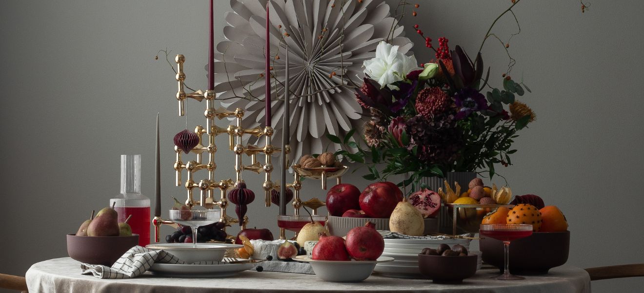
While different colours can easily undermine each other, Ultimate Gray and Illuminating act as a reciprocal catalyst: the radiant yellow is enhanced by the uncluttered gray – and vice versa. Together, they work as two mood makers in the home creating an interior that spreads optimism. And they don’t always need be in balance: The combination of the two Pantone Colors 2021 is particularly exciting when the gray and yellow accents are weighted differently. This is certainly the case with the throw by Silkeborg Uldspinderi with its chequerboard pattern in gray, yellow and white, which gives Scandinavian modernism a new twist – and with the multi-coloured cushions by Skinny la Minx. Alternatively, you can opt for monochrome, for instance the gray table lamp by Present Time and the yellow porcelain elephant by Caussa, and combine the items individually. Pantone’s colour experts also see the duo as ideal trend colours for the home office: “Ultimate Gray provides the firm foundation for Illuminating, a vibrant yellow that heightens awareness and enhances intuition, lighting the way to intellectual curiosity, originality and resourcefulness of an open mind.” The creative professions in particular are likely to benefit from this colour duo
Positive message for the new year
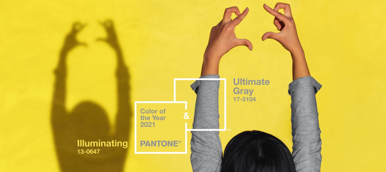
One colour was simply not enough this time around. In the 22 years that Pantone has named its colour for each coming year, they had only once before gone for two colours. At the end of 2020, the company published its trend researchers’ decision for the Pantone Color of the Year 2021 – and suddenly we again had a colour duo: Ultimate Gray and Illuminating. The former is a solid gray reminiscent of stone and rock that symbolises permanence, power and strength; the latter is a radiant yellow, like a summer morning full of promise, which lets us looks forward and represents innovation and intuition. They are only the second colour duo in the history of the annual Pantone Trend Colors, but seem like the logical conclusion to this past exceptional year. For 2021, at any rate, both optimism and permanence are still very much in demand, and the Pantone Colors 2021 offer us plenty of both.
The combination of gray and yellow is certainly not new: The colour duo has long had a firm place in the hearts of many home bloggers and interior and graphic designers because they make a perfect pair: Yellow lifts the mood while gray provides the necessary grounding. Together, they offer almost endless combination possibilities. A further reason for their popularity is that both colours can be found almost anywhere in terms of place and time – bright flower-power interiors are just as possible as are references to mid-century modern design or the 1990s.

PANTONE 17-5104 Ultimate Gray and PANTONE 13-0647 Illuminating, the official names of the two shades, are intended to work in tandem as well as independently. Leatrice Eiseman, Executive Director of the Pantone Color Institute, naturally recommends a combination: “Together, the solid Ultimate Gray and the radiant Illuminating convey a positive message of inner strength. Practical and rock solid, but at the same time warming and optimistic – this is a colour combination for hope and resilience. Strength and confidence are nourishment for the human soul.” With so much harmony on display, though, we shouldn’t forget that the combination of bright, cheerful yellow with solid gray can be visually exciting and offer stimulating design combinations and contrasts. Our examples from interior and product design, gastronomy and architecture show some of the diverse ways in which the Pantone Colors 2021 can be used.


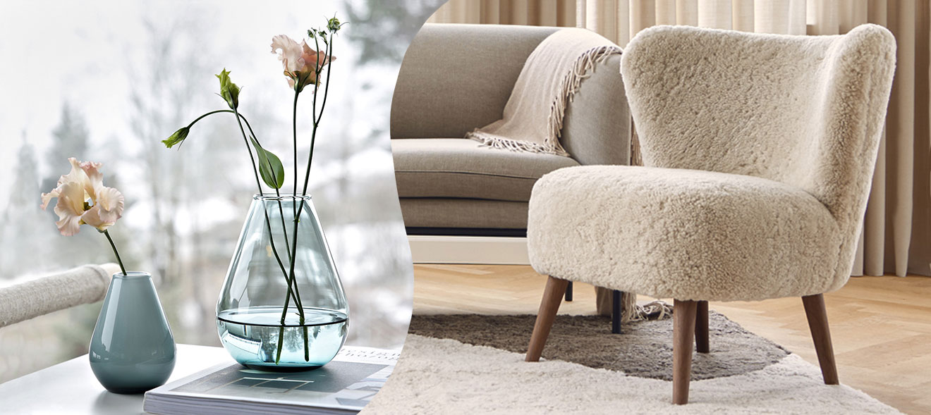
Unbeatable duo for the living room and home office
While different colours can easily undermine each other, Ultimate Gray and Illuminating act as a reciprocal catalyst: the radiant yellow is enhanced by the uncluttered gray – and vice versa. Together, they work as two mood makers in the home creating an interior that spreads optimism. And they don’t always need be in balance: The combination of the two Pantone Colors 2021 is particularly exciting when the gray and yellow accents are weighted differently. This is certainly the case with the throw by Silkeborg Uldspinderi with its chequerboard pattern in gray, yellow and white, which gives Scandinavian modernism a new twist – and with the multi-coloured cushions by Skinny la Minx. Alternatively, you can opt for monochrome, for instance the gray table lamp by Present Time and the yellow porcelain elephant by Caussa, and combine the items individually. Pantone’s colour experts also see the duo as ideal trend colours for the home office: “Ultimate Gray provides the firm foundation for Illuminating, a vibrant yellow that heightens awareness and enhances intuition, lighting the way to intellectual curiosity, originality and resourcefulness of an open mind.” The creative professions in particular are likely to benefit from this colour duo.

Interiors in yellow and gray
Nothing shouts “California!” quite like bright yellow – the colour of constant sunshine. It comes as no surprise then that The Standard Hotel in Los Angeles has long made use of this vibrant hue. The hotel’s restaurant with bar is a dream in yellow with incandescent American diner-style benches, tables, bar stools, swivel chairs, floor and walls. In the hotel’s bedrooms, gray carpets, yellow colour accents and gray-and-yellow patterned bed covers convey Californian hospitality in the Pantone Colors 2021.


At home, too, you can draw on the synergy of radiant yellow and stone gray – without having to go completely over the top! Small-scale arrangements, for instance this Present Time clock and light, benefit just as much from the new mood makers as entire home interiors.

Brilliant highlights: table settings with Pantone Colors 2021
Berlin’s Honiggelb Café provides some really bright ideas for table settings. The restaurant simply exudes the lightness of summer – thanks partly to some design classics from the flower power era, but mainly to its owner’s predominantly yellow collection of tableware. And because gray goes so well with yellow, a few accents of the second Pantone Trend Color 2021 can also be found here, providing a fitting backdrop for the buttercup-coloured plates, cups, lamps and chairs.


And if you don’t want to go all-out yellow, you can create visual eye-catchers with specially selected accessories such as the silicone pot holders from Monkey Business – or with multicoloured tableware from Ekobo, which can be successfully combined with your own individual pieces, possibly in bright yellow. This infectiously positive mood can easily be transported outdoors with a thermos flask and to-go mug from Rosendahl. Using gray as a counterpart lends the necessary sense of gravitas to tableware and table settings.


Sweet dreams in gray
The Pantone Colors 2021 deliberately focus on a contrasting pair. While yellow tones have a vitalising and energising effect and are therefore an excellent choice, for instance for the breakfast table, gray is able to create a calm, safe atmosphere. Quite understandably the colour experts used attributes such as “solid reliability” and “serenity” to describe the more restrained of their two Pantone Colors 2021. It’s an ideal shade for your own bedroom – and also for guest rooms. This impression can be reinforced with the use of textured materials, such as the quilt from Ib Laursen, which is complemented by cushions in other shades of gray. Children, too, feel comfortable with gray. Especially when the colour comes in the form of a play and adventure tent like the one here by Overseas Kidslife, which promises lots of fun – and bright yellow details.


Positive giving with the Pantone Trend Colors 2021
The tradition of giving gifts has been an integral part of all cultures and eras. Since time immemorial, gifts have been used not just as a form of material recognition, but also as a symbol of mutual friendship and appreciation or simply as an expression of certain sentiments that the giver wishes to convey to the recipient. The colour experts at Pantone describe their Trend Colors 2021 as a common “expression of deep thoughtfulness paired with the promise of sunny days ahead”. And this optimism certainly wants to be shared – so, what about starting the new year by giving a present in solid gray and vibrant yellow that radiates positivity?

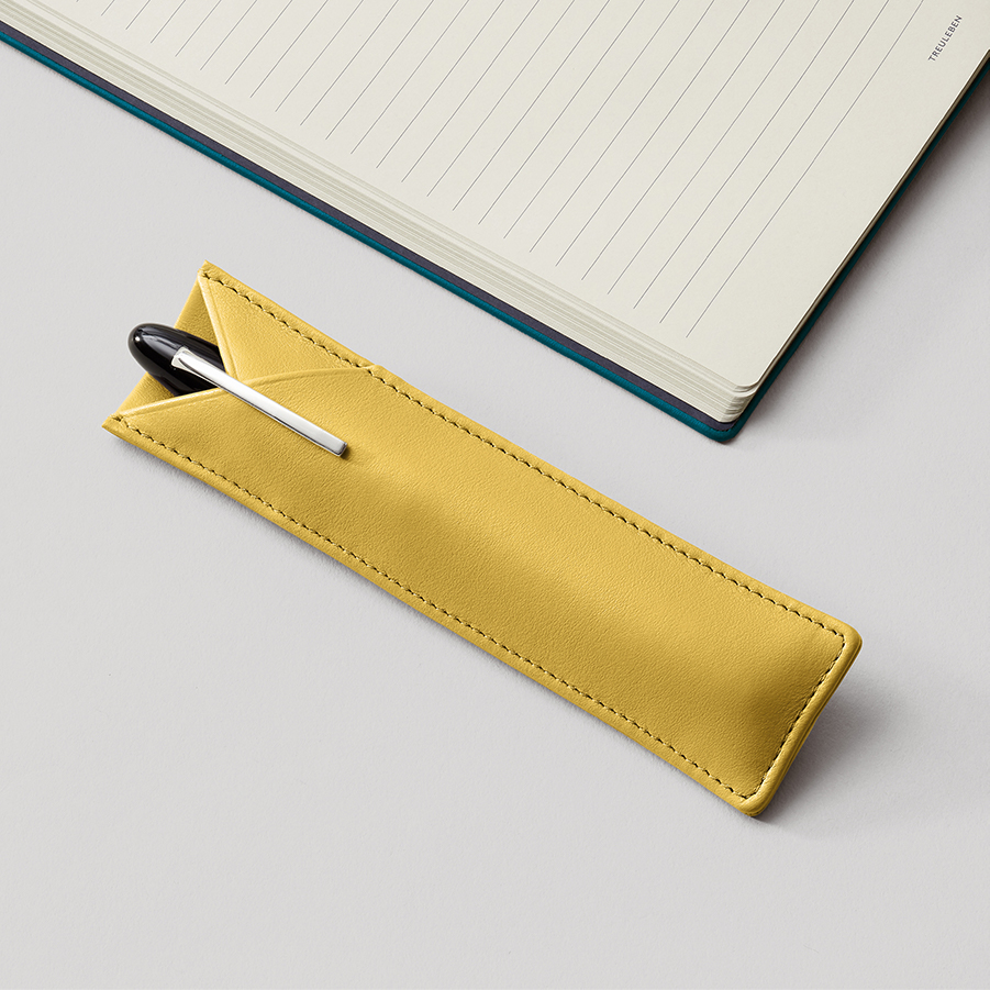
A cool example of this combination are the yellow glasses with gray case from Have a Look. Or you could give a close friend a pair of socks by Doiy Design in one of the two trend colours for 2021 and keep the other one for yourself – provided the two of you meet up regularly, of course! Other accessories such as the gray smartphone case by Chi Chi Fan or the pen sleeve by Treuleben made of bright yellow leather each display one of the two Pantone Trend Colours 2021. Traditional looks coupled with state-of-the-art technology – that’s the combination of table lamp and LED speaker by MoriMori. The optimistic message that Pantone wants to give with this year’s colour choice can be passed on – with positive thoughts and positive gifts. And don’t forget to treat yourself to a gift, too 😉.


Header: Pantone