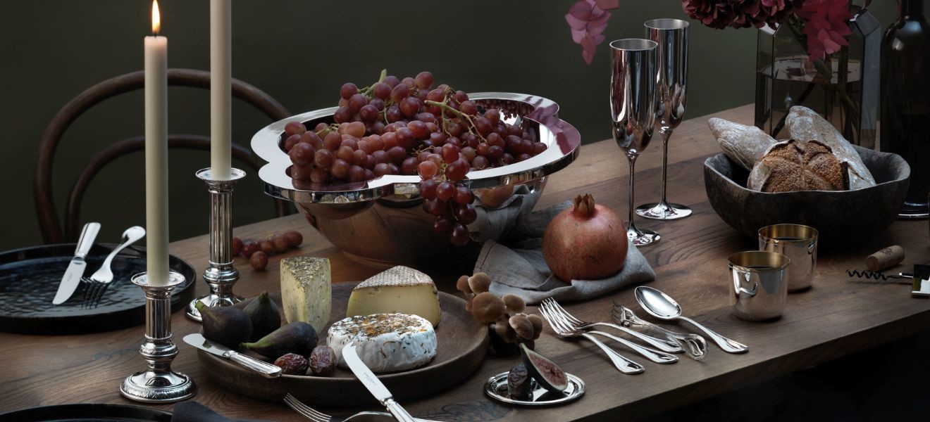
The 1980s look is very popular today, which is why we set out on a voyage of discovery around Ambiente to put the household classics of the 80s under the spotlight. We particularly liked the colourful range of styles that reflected the mood of this provocative decade with its many eccentric escapades. The resonant irony of some of the objects made us smile and unearthing their stories kept us in constantly good humour during our tour. It was not hard at all for us to see why these particular products had become top sellers.
Is it a bird?
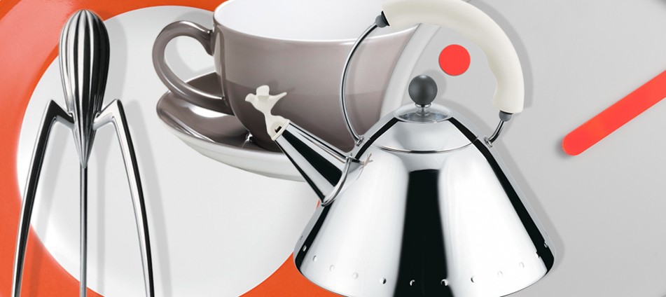
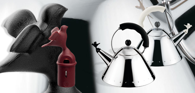
Does waking to birdsong help cheer up grumpy early morning risers? Apparently so – and particularly if the sounds come from the ‘Birdwhistle Kettle’ designed by Michael Graves for Alessi. This perennial favourite, which first appeared in 1985, is easily recognisable as an object of the post-modern age. Picking up on diverse ideas – as is characteristic of this decade – the kettle displays an array of influences from art deco to pop art and draws heavily on the design of comics. On a conical body of stainless steel, Graves attached a rounded handle dominated by a thick blue plastic grip. The final touch is the bird that is reminiscent not only of classic porcelain but also of the figures on car radiator grilles. It’s an original mix of form and materials that breaks down the strictness of the basic geometric shape and still looks very attractive three decades later.
Is this art or …? A conversation piece.
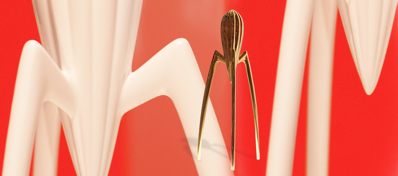
Philippe Starck’s lemon press is an undisputed icon of the kitchen and, with its 25th anniversary being celebrated this year, is making a name for itself again in the media. With its unique shape it still – after a quarter of a century – is seen as ‘futuristic’ and ‘eccentric’ and continues to annoy some people. Its impracticality is legendary. But it is precisely because of these characteristics that it works so well as an example of the basic design philosophy of the 1980s. In short, functionality is sacrificed on the altar of extravagance and originality.
Originally designed in 1987, the Juicy Salif has been in constant production at Alessi since 1990. To celebrate its 25th anniversary, a limited white edition of this eye-catching object was brought out in solid cast bronze. This special piece actually came with a warning from the manufacturer that it should not be used to press lemons as the material would be permanently damaged. This not only emphasised the artistic status of the object but also reflected the ironic response of Starck to the initial criticisms of his product. Apparently the designer replied to the accusation of user-unfriendliness by saying that it was more a conversation piece than a functional object. Its cult status is unassailable.
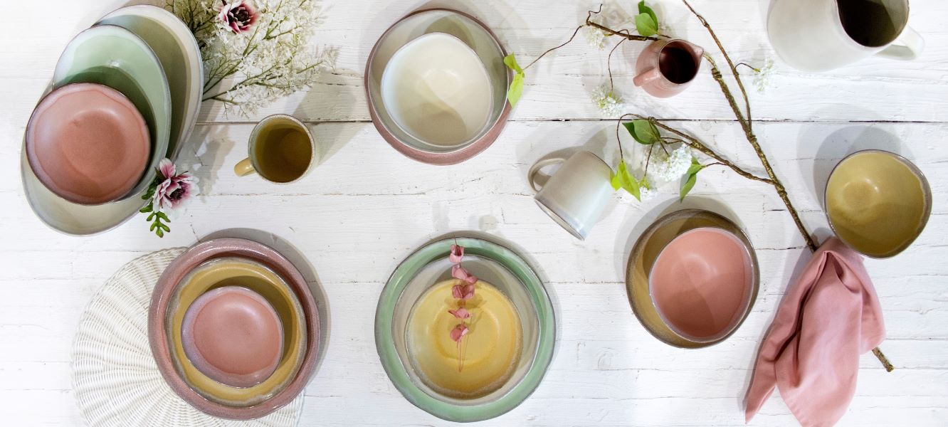
Mix it, love it – porcelain with addictive potential.
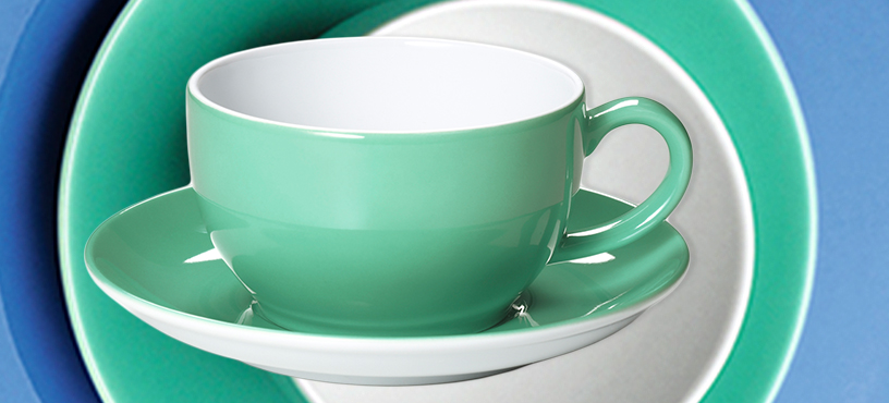
The bright Solid Color product series from Dibbern is definitely designed for practicality. Now available in 42 colours it has been extremely successfully produced by these manufacturers of china products since 1982. Bernd T. Dibbern managed to create a style fusion of two different eras with his collection. The clean form is inspired by Bauhaus and has its origins in a hotel china service designed in 1936 for Schönwald. However, the brilliant colours and the playful possibilities of individual combinations absolutely reflect the feel of the 1980s. It’s not difficult to see why this range has serious addictive potential. Who wouldn’t like to have all these attractive and cheerful colours in their kitchen?
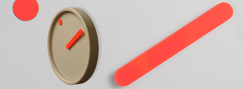
A high-contrast visualisation of the times.
When Danish design duo Steen Georg Christensen and Erling Andersen designed their Picto clock collection in 1984, they wanted to visualise the time as such. The name Picto reflects this desire. The wall clocks in this series can be found both in the Timepieces collection of Rosendahl Copenhagen but also – as design icons – in the permanent exhibition at MoMa, the Museum of Modern Art in New York.
These simply designed clocks are available today in four different colours, which are significantly influenced by the 1980s penchant for striking colour contrasts. The designers earned considerable praise and recognition for their technical innovation with the principle of the rotating disk. The minute hand is the same as in conventional clocks, but the hour hand is portrayed by a dot or hole in the disk that rotates on the monochrome face. The dot turns like a celestial body around the sun and symbolises the passing of time.
Having arrived at the end of our tour, we not only still had a number of design items from the 80s on our wish list, we also finished with a strong desire to find out more about this decade and its products. At the next Ambiente we shall extend our feelers even further and continue our fascinating journey through time.