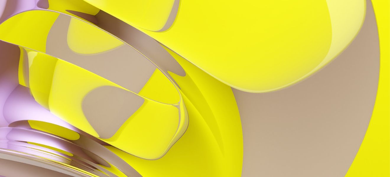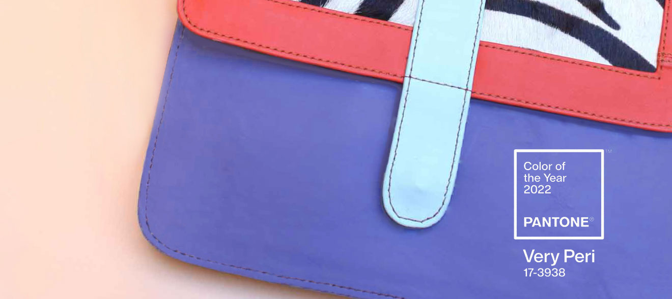
It’s a visual statement of how we feel about life right now. The Pantone Color 2022 symbolises how our world is changing, how our real and digital lives are merging. For the very first time, the Pantone Color of the Year programme has created a whole new color: Very Peri.
It was Classic Blue in 2020, and Ultimate Gray paired with radiant Illuminating yellow in 2021. The Pantone Color 2022 is Very Peri – a complex shade that combines the calm and dependability of blue with the energy and potential of red. Very Peri expands Pantone’s trusted color family and brings a new aspect. It has a lively, joyful perspective and dynamic presence, inspiring bold creativity and giving imaginative expression. Indeed, Very Peri is full of possibilities. It is open to new visions and viewpoints, full of hope and unbridled curiosity at a time of transition.
Pantone Color of the Year: real meets virtual.
We’ve just been through a period of intense isolation. While there were fewer entertainment options, we visited virtual worlds more frequently, exploring new colors and possibilities. Digital design expands the confines of our reality. It weaves closer connections between our physical and virtual lives than ever before.
Pantone 17-3938 Very Peri embodies this blurring of boundaries, by blending blue with red. The shade is reminiscent of vibrant Microsoft hues: it’s no accident that it reminds us of virtual conferences. Trends from the digital world can enter the physical realm and vice-versa – accelerated by non-fungible tokens (NFTs) and the metaverse. Very Peri is in the air. The Pantone Color 2022 has emerged from the many color possibilities crossing our screens, and provides us with impetus to exploit all these options.
Very Peri – more than just a color trend.
The Pantone Color of the Year is way more than just a color trend or fashion – it reflects our society, and how we feel. It expresses the times we live in; it illustrates our world. The color is chosen after countless trend analyses and detailed observations. Color experts from the Pantone Color Institute consider color trends in film and entertainment, art, fashion and design, as well as lifestyles and playstyles. Social media platforms, major events and new technologies, materials, structures and effects can also influence the choice of color. For 23 years, Pantone has been choosing its Color of the Year. This color exerts influence internationally on product developments and buying decisions in numerous sectors, including industrial and product design.
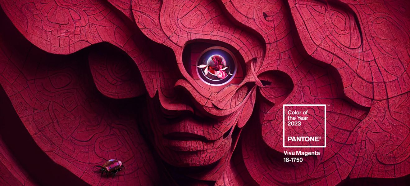
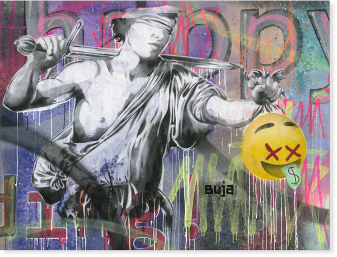
The Pantone Color for 2022 is abstract and futuristic, symbolising the transition between physical and digital. It has inspired the art world, as in the Fine Art giclée pigment print by Ambiente exhibitor Art Edition Barhoul.
Inspiration from Ambiente exhibitors.
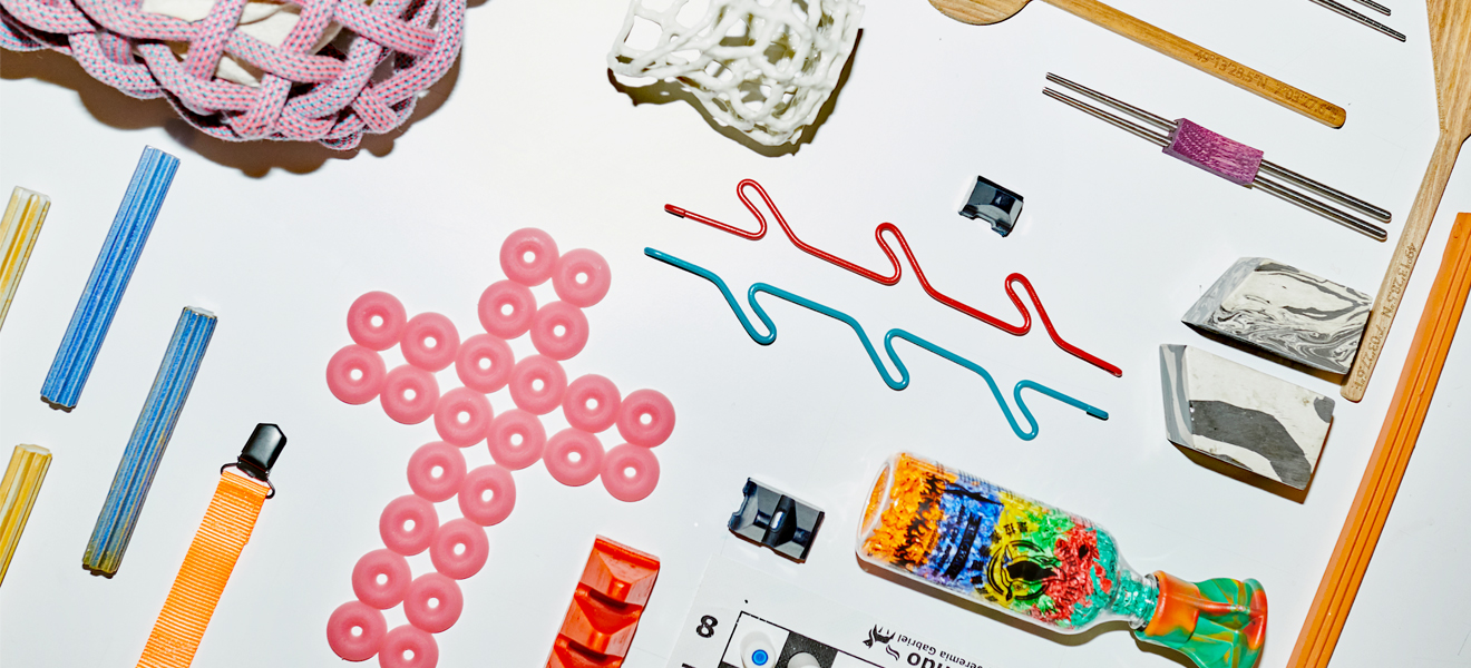
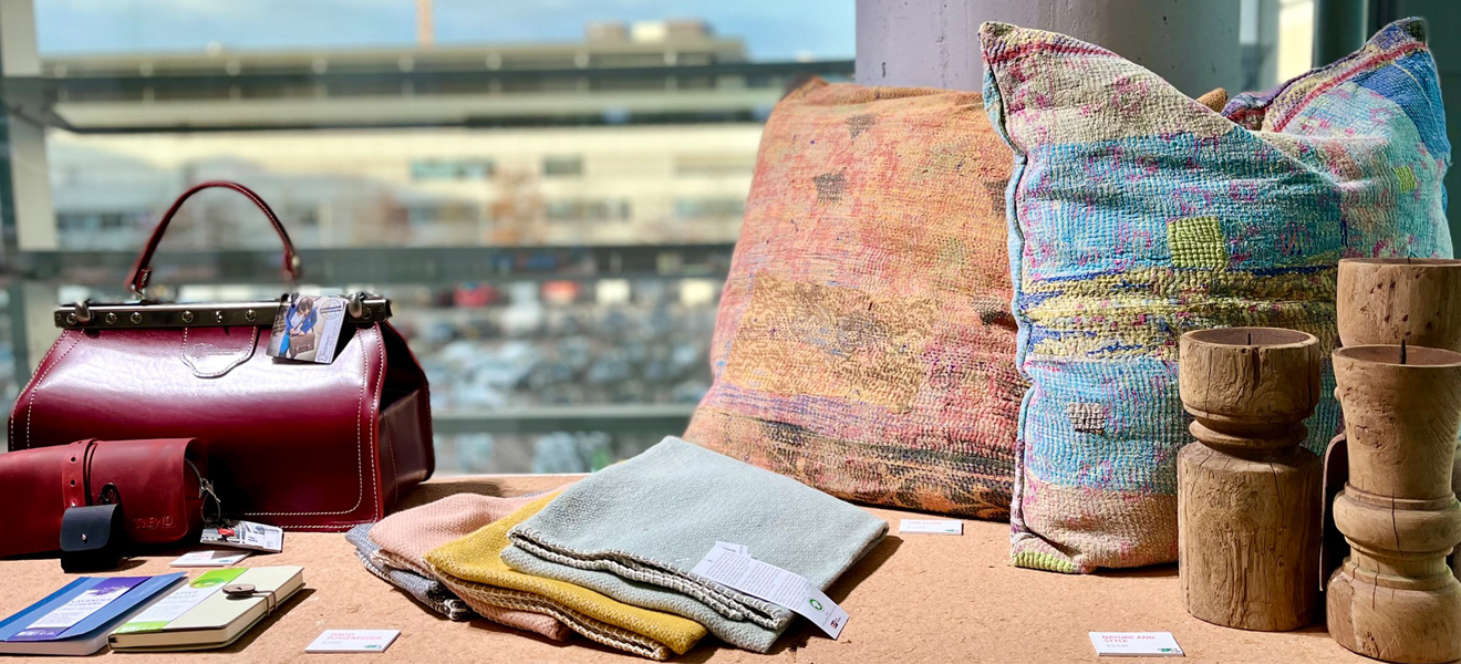
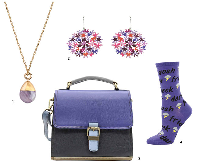
The Pantone Color 2022 increasingly blazes a trail for interior design and accessories, as we have seen among many exhibitors at Ambiente – where industry themes and trends are often spotted first. Very Peri is evident on bags by Spanish label Soruka, hand-sewn from recycled leather and leather scraps. Traditional techniques are maintained and valued, and nothing is wasted: our future is sure to choose zero waste, sustainable manufacturing and fair trade as we seek solutions.
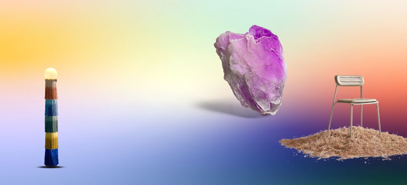
The rise of this distinctive shade means the semi-precious gemstone amethyst is making a comeback, as in this pendant from Timi of Sweden.
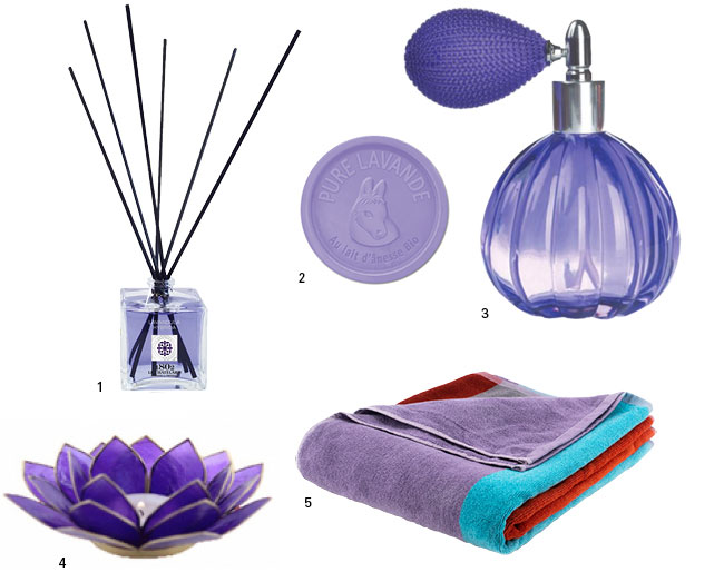
Lavender is also in demand for the same reason: we like this bath towel by Remember, but there are lots of other examples. The unmistakeable scent of this Mediterranean plant is also experiencing a renaissance – as in the room fragrance by Le Chatelard 1802 and the perfume and soap by traditional producer Esprit Provence.
Communicative and interactive: Pantone Color 2022.
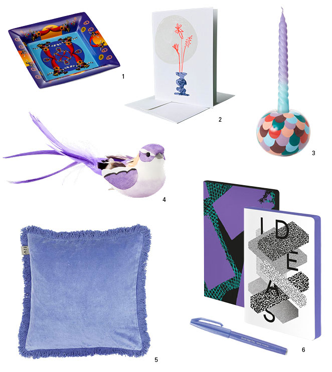
The Pantone Color of the Year expresses our hope that we can find answers in color, says Laurie Pressman, Vice President of the Pantone Color Institute. She describes the impact of Very Peri: “Society continues to recognise color as a critical form of communication, and a way to express and affect ideas and emotions and engage and connect.” This is illustrated by home accessories full of feeling from Liv Interior, notebooks by Nuuna and premium greeting cards from The Buttique.
Pantone 17-3938 – the joy of combination.
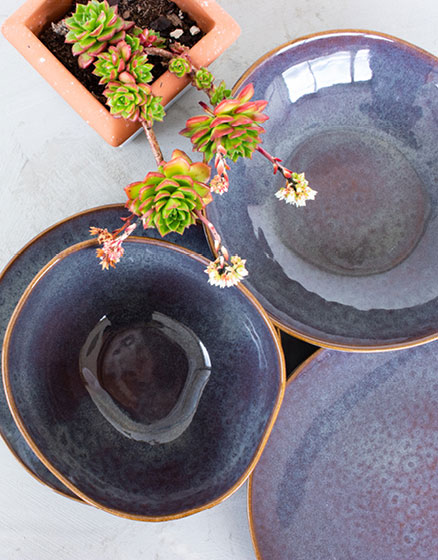
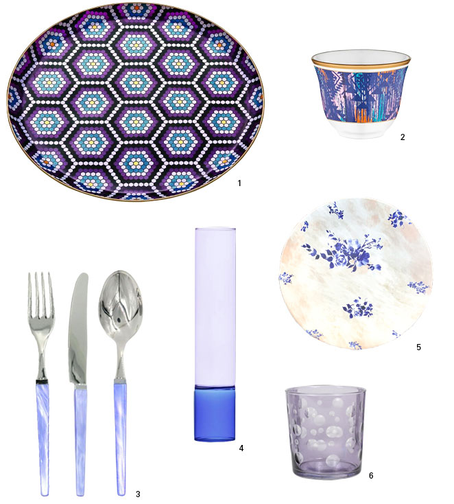
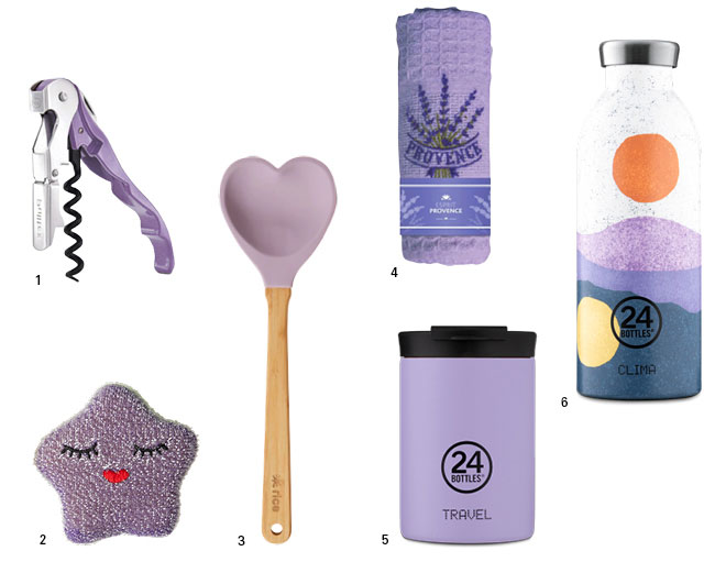
Products can point up just how flexible and versatile the new Pantone color is. Ambiente exhibitors in the Dining area are dishing up Very Peri tableware: take EQC Ceramics, or the brightly patterned tea service by Turkish brand Glore Glass, reusable cups and insulated bottles from 24 Bottles, and a host of new ideas from Rakle, Mesa Ceramics and others.
Kitchen accessories can take an original turn: for instance, the manufacturer Rice with its ‘hearty’ wooden spoons and smiling sponges. Very Peri items will be a focal point for any smartly dressed table – and Kinta make their authentic interior accessories by hand. Unusually, all their designs can be freely combined with one another: lovely, and sustainable!
Title: Soruka