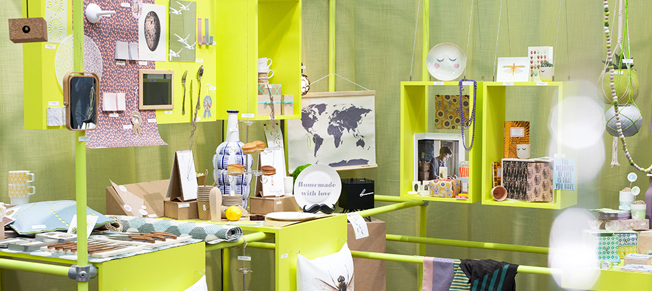
Intense monochromes meet colourful squares. Ornamentation does more than merely decorate functional objects. The ‘jumbled pattern’ look is spilling out over porcelain, textiles and paper – in fact almost every interior object. It catches the eye and takes us on a journey of imagination.
Cornucopia
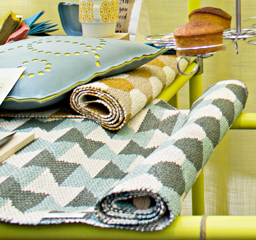
Who says you need to set the table with matching crockery? Or that serviettes must match the crockery colour? There are now so many enchanting designs, structures and subtle colours that it’s time to dig deep into this cornucopia. Sometimes more actually is more! You can set the same table with different ceramic product ranges from Bloomingville, and put hot tea and coffee cups on coasters made by PA Design, which reveal the face of the moon when warm. Swedish manufacturer Pappelina designs tea towels, table runners and cushions with clear contours consisting of circles and stripes. This look really complements the lively greeting cards by Braun + Company that you can use to invite your guests.
Ornamentation and beautification
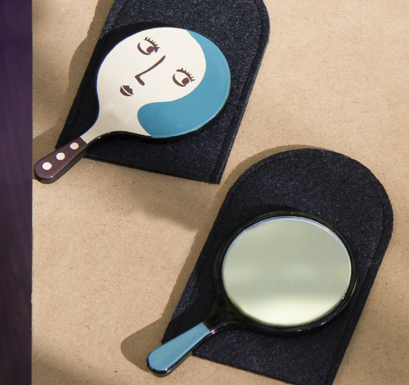
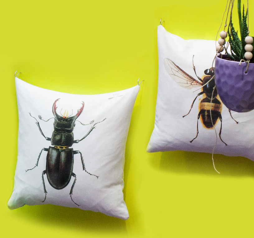
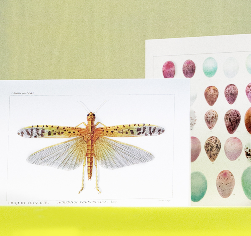
Also new in: figurative decorations stand side by side with ornamental patterns. They might be small hand mirrors by Atsuko Matano – connecting the feminine form to yin and yang with a knowing wink – or cushions with larger-than-life stag beetles, or even soft dragonflies on gift cards, both by Sköna Ting. Such small creatures are increasingly coming out of the woodwork, ushering in an undercurrent of playfulness.
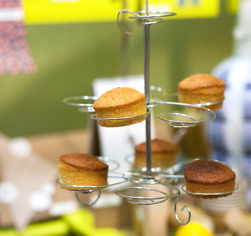
Bright and breezy
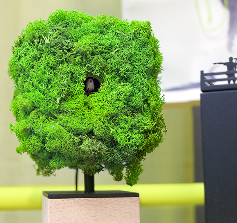
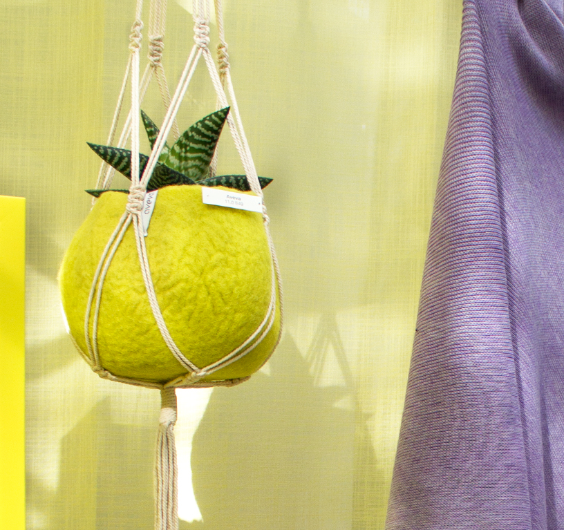
The trend towards bright and breezy is everywhere. Birkmann presents your home-baked muffins floating freely as if on a chandelier, and the lime-green flowerpot holder by Aveva sails away in its own ‘hot air balloon’. Can you have too much of a good thing? No, and why shouldn’t plants enjoy what the birds and dragonflies do? But it’s good for us to get a change of perspective, as anyone would when using this umbrella stand by Projetti: it looks like an umbrella itself! Or how about a cuckoo clock that mocks birdwatchers? Studio Kuadra has designed a two-part cuckoo clock, with a little bird sitting deep in virgin forest and ‘birdwatchers’ with binoculars desperately trying to find it.
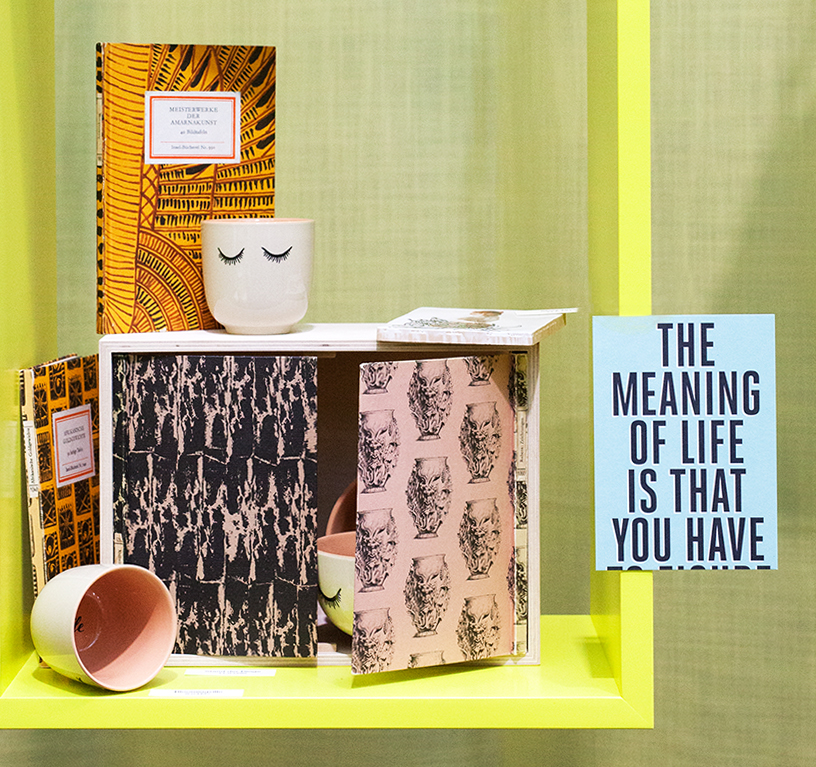
Playful transformations
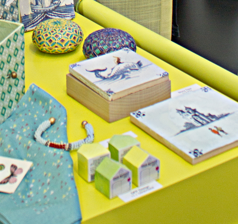
This ‘mix and clash’ principle not only brings colour and movement, it is also very liberating. Imagination transforms the conventional to make room for individuality. Stand der Dinge has made a small cabinet for your favourite books. What’s so special is that the doors are made of decorative covers from classic Insel Verlag books, much-loved in German homes for decades. You can even change the covers, so you’re never stuck with a single look. It’s ideal for our age of flexibility. Storytiles from the Netherlands offer a different sort of transformation. Contemporary figures and subjects have been added to tiles in a 17th-century Delft pottery style. They stand out in clear colour against the traditional blue-grey backdrop, yet it’s an amazingly harmonious combination. Indeed, one of the most astounding insights of the ‘jumbled pattern’ trend is how this heady mix can work in our everyday lives – not just for occasional flights of fancy.