Sometimes they look industrial, sometimes delicate – but always architectural. Graphic lines bring order to living spaces. The ‘frame style’ will streamline any room, while leaving enough leeway for personal design choices.
It all began with an experiment. Designer Tom Dixon had set himself the challenge of developing the lightest metal chair in the world. Inspired by the architecture of major bridges and electricity pylons, he designed the ‘pylon’ chair in the early 1990s – a chair with a complex grid structure made from 3 mm stainless steel wires. Dixon explains: “The making and remaking of the Pylon Chair countless times […] taught me how to make things properly […] The results made me believe more in the underlying structures of an object than their surfaces.”

Due in part to his innovative work with metal, Tom Dixon’s design skills are today among the most sought-after worldwide. The Pylon Chair now also has a table to go with it. There’s a long waiting list to buy a Pylon Chair. So, why is this chair such a firm favourite? Although it might not look very luxurious at first glance with its pared-down aesthetic, its charm comes from the visual stimulation it creates – like a work of art, like architecture in miniature. It has greater aesthetic value than your average chair (and in fact it is surprisingly comfortable).
2 Clock by Progetti
3 Chair by Fuhrhome
4 Lamp by KARE
2 Clock by Progetti
3 Chair by Fuhrhome
4 Lamp by KARE
Taking a closer look
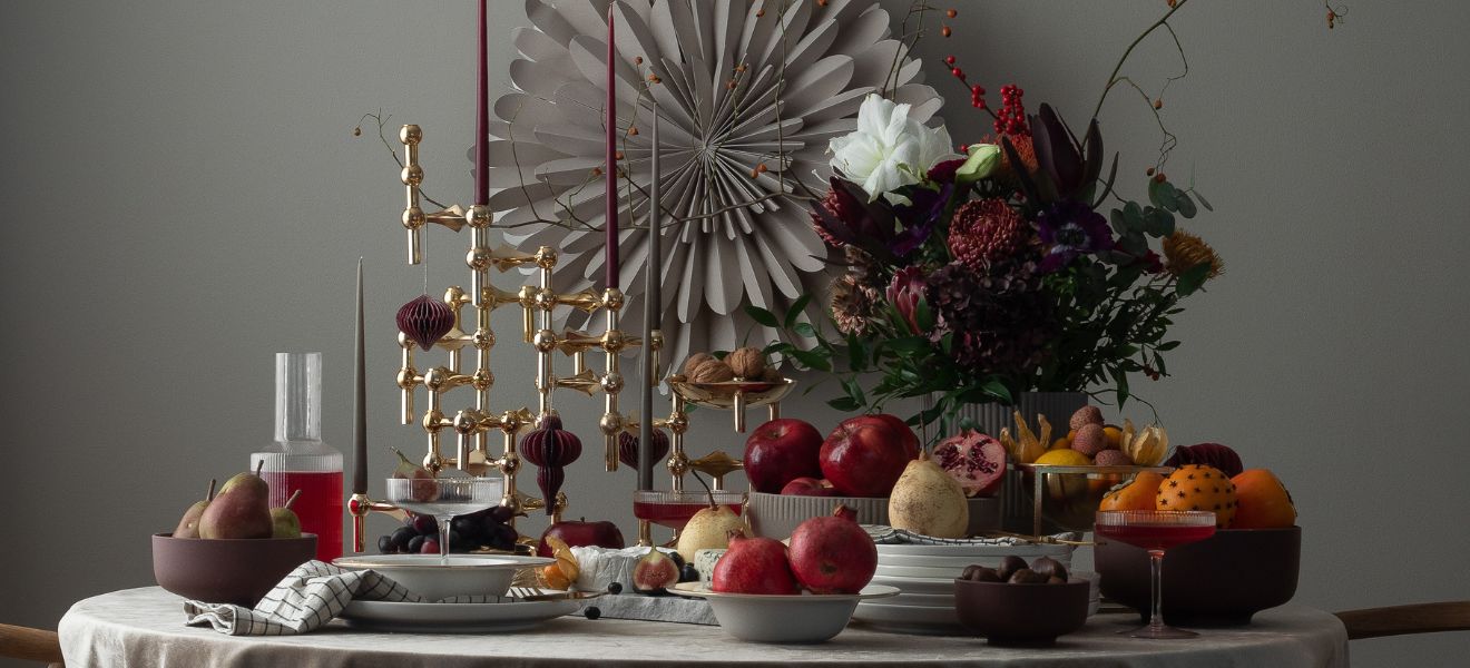
What fascinates Dixon is investigating an object’s skeleton structure, not the surfaces. Increasing numbers of designers now work with this aspect. Some of these designs look more architectural than others, and although they may be far less complex than Dixon’s chair, they’re all eye-catching products and include screens, clocks, lamps and many other objects. All these creations, which play with volume and embody invisible space with millimetre precision, look as if they were invented to fit together – whether they look stark, playful, delicate or robust. The designs are all practical too: where else would you find a side table which doubles as a basket?


You can see how diverse these items made from wire are if you try to classify them. Some look modernist, some display a Bauhaus style, while others are like art deco objects. Items like these dishes by Livwise resonate with mid-century modern. They could be companion pieces to Harry Bertoia’s designs: he works with wire, metal and plywood, taking the line as his muse. Bertoia’s most famous item of furniture is the sculptural Diamond Chair, designed for Knoll in 1952. He knew more than anyone about “bringing a line alive”, as curator Glenn Adamson describes it.

Strict geometry
In the Japanese restaurant Kanto on Lake Como, interior designer Fabio Gianoli has made a virtue of these graphic lines. He told us: “I have always been fascinated by this country’s culture, so I wanted to find the best way of developing a strong, respectful position towards Japanese philosophy.” The restaurant extends around a central island made from iron pipework which is partly used as shelving, and partly to hang plants on. “I wanted to create a space which is ordered, symmetrical, rigid, but also includes many little details, just like the dishes in Japanese cuisine.”


2 Bottle rack by Zack
3 Trivet by Oyoy
4 Tray by Dôme Deco


Mogens Lassen was a Danish designer who also made his name by adopting clean lines. His strong functionalist bent brought him to design the ‘Kubus’ candlestick in 1962, originally for family and close friends. Nowadays by Lassen sells this design, renowned among minimalist architects and design connoisseurs as a classic. A whole range of products has subsequently emerged around the candlestick, including the ‘Twin Bookcase’ with two-tone reversible shelves, still made by experienced craft professionals in the Danish town of Holstebro. This is where Lassen’s products really come into their own, alongside others which emerged from the same school, including trays, teapots and more.


Graphic lines can also be used for lighting, as Swarovski has done with its Fyra range: here crystals catch the light with each of their facets and project it onto the wall as multiple fragments, while suspended from a Chinese-lantern-like metal frame. They almost look like exhibition pieces, yet don’t dominate the room. This highly geometric design chimes with many of the developments that have taken place in graphics and design over the past five years.
Czech designer Jan Plechac investigated the impact of clean lines in his ‘Icons’ series. He rebuilt pieces of classic furniture like Gerrit Rietveld’s Red Blue Chair entirely out of wire, thus placing them in a new context. “It was an attempt to arouse new emotions through old memories.” Any indication of form and function, or of whether the furniture should be used indoors or out, fades into the background; the wire structure dematerialises the design and gives it a new quality.
2 Champagne flute by The DRH Collection
3 Rack by Zanetto
2 Champagne flute by The DRH Collection
3 Rack by Zanetto
With their clear structure, graphic objects bring order to the home on the one hand, while on the other combining this strict architectural look with a relatively delicate profile and a certain lightness of touch. They order life, but don’t hide it away. It doesn’t matter if they’re used as a dividing wall or as a bathroom shelving unit, or even in the kitchen. They draw elegant lines wherever they go. And the materials they’re combined with, be it raw concrete or velvety upholstery, determine how industrial they feel (the most common combinations being concrete and steel). They fit in, wherever you position them.


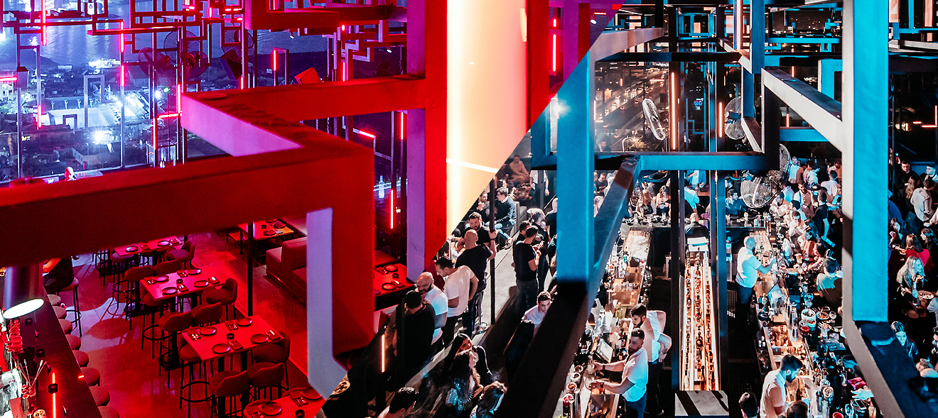
Graphic lines can also set new standards when presented with style. Hence in Beirut, where restaurants and bars need to make a big effort to stand out from the crowd, the ‘Spine’ rooftop bar has succeeded admirably. Instead of referencing the building’s existing architecture, Lebanese design studio Gatserelia created a lighting structure whose aesthetic is directed upwards and looks like an image of the skyline. Tetris-like blocks begin the evening in subtle, monochrome shades and become ever more dynamic as night draws in. They become one with the music and the movements of the guests, lit up in hundreds of different colours. That’s how fine lines can make a big splash.