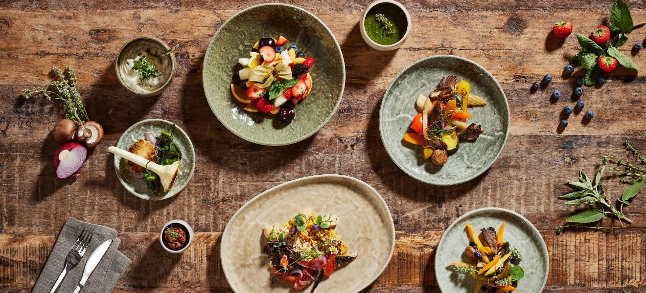
2018 began at Ambiente with strong combinations and a coming-together of shapes and colours. The dinner services on display bring a sense of luxury while still being perfect for everyday use. Historical elements are taken boldly into the present, and feelings and tactile experiences play an important role. Once you’ve touched these new products, you’ll want to take them home with you.
Feel the difference – glossy and matt surfaces
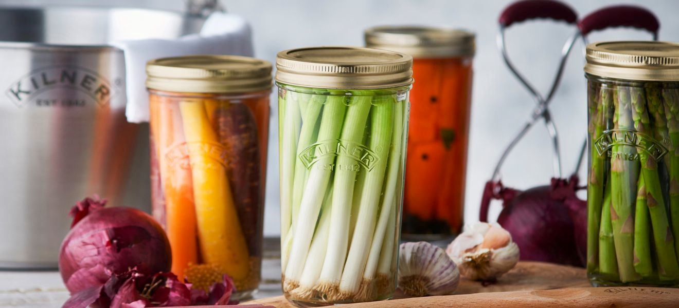
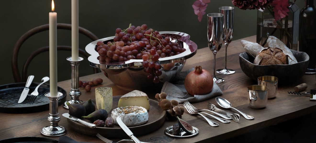
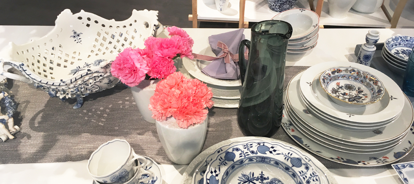
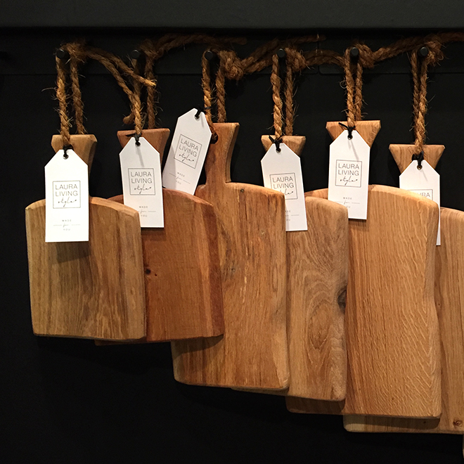
“I am a tactile sort of person” was one of the comments most frequently heard in the aisles of the exhibition halls as visitors took hold of plates, bowls and kitchen utensils. They felt the surfaces, weighed them and stroked them. There seems to be a compelling and consistent theory behind many of these designer creations: Since we are constantly touching our smartphones, our fingertips are now looking for surfaces that feel more exciting than a touchscreen. Beauty is made tangible through objects with rough structures, embossed patterns, exciting shapes and the interplay of high-gloss and matt glazes. Take, for instance, the coffee and tea service designed by architect Norman Foster for Stelton. Its mirror-smooth stainless steel jugs and matt-white porcelain cups are not a contrast, but an exciting combination. Different surfaces intermingle in the tableware ranges of Rosenthal and many others. With the vases from Lyngby, the glossy glaze flows in streaks over the matt porcelain. And the Laura Living wooden boards retain their natural, tangible grain. In this way, things become alive, real and unique – but without inundating our senses.


Re-invention: history rediscovered
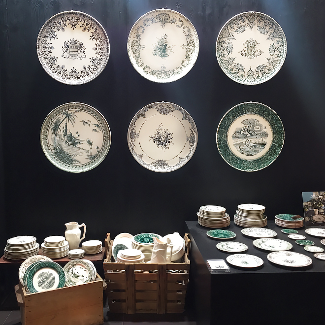
Many designers have taken their inspiration from history. Gien has retrieved 19th century porcelain motifs from the archives for its tableware and the simple designs appear anything but outdated today in 2018. New Kähler thermos jugs, espresso cups and flower pots are inspired by the design of a more than 100-year-old vase created by Svend Hammershoi. And an illustration by the Japanese artist Katsushika decorates Goebel porcelain and appears so modern that it is hard to believe that it first saw the light of day in 1832.
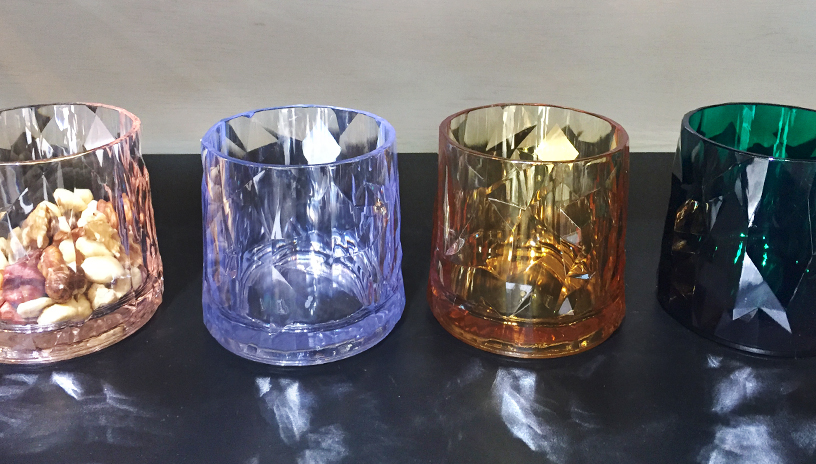
Tried-and-tested ideas are also being rediscovered in the design of glasses. Amber-coloured retro glasses such as those from Nordal, as well as the fine cut crystal and Art Deco borrowings from Charles Schumann’s new bar collection for Zwiesel have classic quality. Koziol has delighted consumers with the “Superglas” series of glasses. They enhance the table and look like sophisticated, colourful crystal treasures – but are in fact everyday plastic glasses strong enough to survive the wildest pool parties.


Statement pieces: graphic patterns and floral displays
Striking designs with clean lines from ASA Selection, oriental patterns from Images d’Orient or retro charm from Remember turn a kitchen table into a self-confident design platform that gives a strong message. The time when crockery simply played a quiet supporting role is clearly over. Flower motifs are again luxuriant, colourful and confident – as can be seen in the Maxwell & Williams dinner service. The real eye-catchers at the fair were the limited-edition kitchen utensils by Smeg, which Dolce & Gabbana painted with Sicilian flower dreams. Tacky? No – self-confident! The new Arzberg designs by Michael Sieger, which combine polygons and plump peonies with both matt and glossy details, show that it is possible to combine graphic and floral elements.


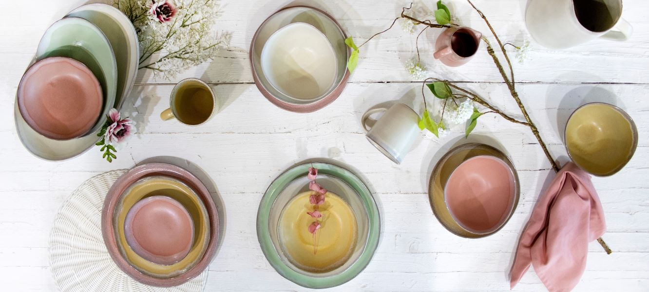
Perfect companions: pastel and powder shades
Pastel is the new white. Since dinner services in pastel and powder shades combine extremely well with other patterns, they have become almost the standard. ASA Selection demonstrate how well light blue and yellow go with dark fired ceramics, and the mix-and-match crockery designed by Sophie Conran for Portmeirion is just as suitable for everyday use as the Dibbert classic candy-coloured tableware and the matt-finish bowls and vases from Räder. The delicate spring colours look good even on robust kitchen appliances, such as the silk-matt Kitchen-Aid and Berghoff cooking utensils.