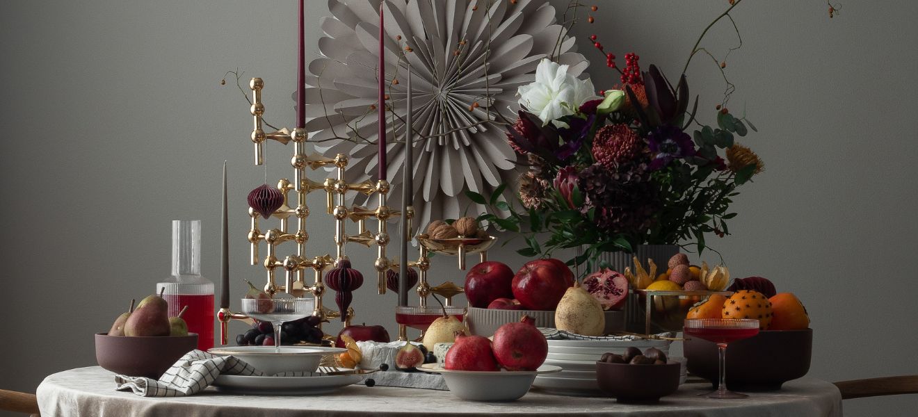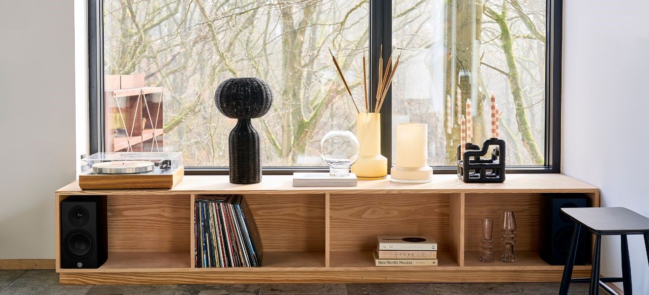
Don’t be afraid of colour! Colour is something that is difficult to conceptualise and its effect is even less easy to judge. Playing safe is not an option here. However, applied in the right amount together with a little experimentation and playful handling, coloured textures, cushions and furniture can be used like a box of coloured pencils. Paint your world in the colours you like.
It has to feel right
Yellow brings the sun into the house, red provides energy and blue appears cool and clean. Colours carry meaning, express feelings, attract attention and have a symbolic effect. Coloured surfaces, furniture and accessories can stimulate us, refresh us or calm us down. The good thing is that when it comes to colours, you are the best person to decide what you like. In terms of overall design, it is important to keep an eye on small colour details. The entire colour composition starts to change when a red bowl suddenly comes into view. The colour of design details plays a major role. Restaurants such as “Ya Pan” in Tel Aviv and “Lido Malkasten” in Düsseldorf, which was newly designed by artist Rosemarie Trockel, are great examples of this: The key to success is to look at your surroundings in the same way as a painter.


2 Wall clock by Progetti
3 Acoustic panels by Hey-SIGN
4 Coffee pot by Bialetti
5 Organiser by 100 Percent Store Japan
Everything in dialogue
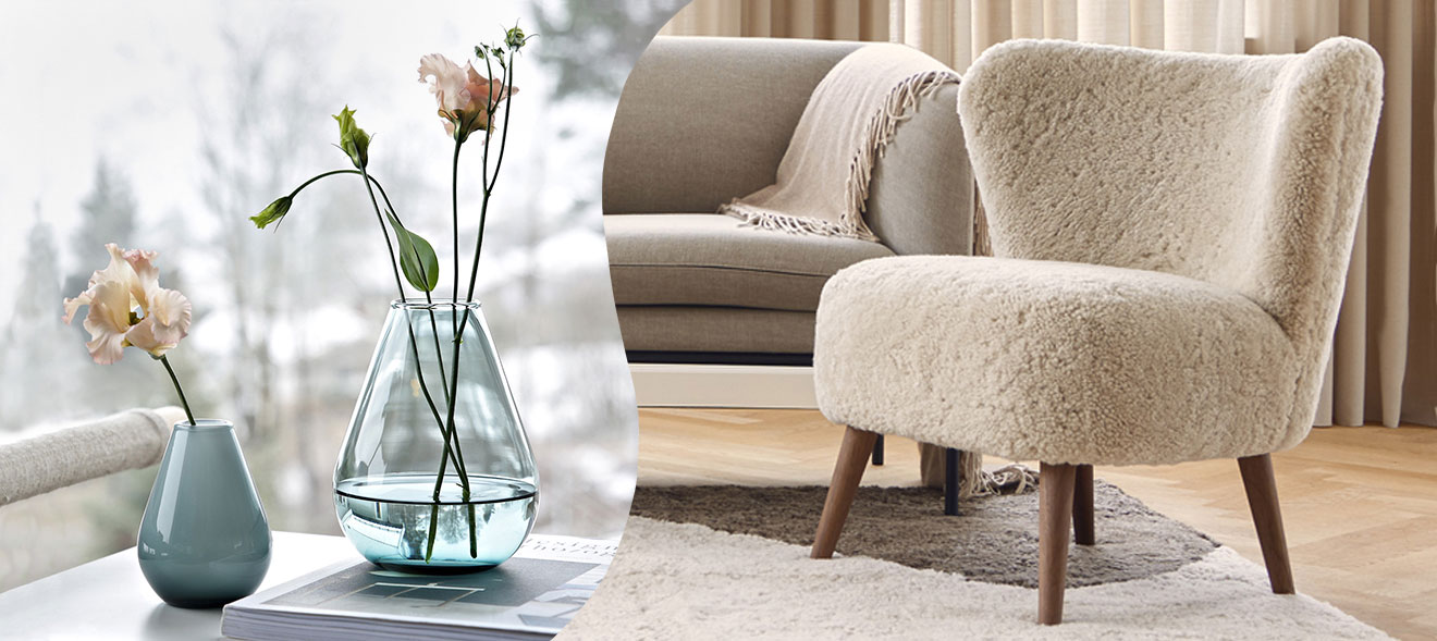
Young and lively or clear and structured? It is important to understand what you want to achieve in terms of the ambience of a room. Often you end up with completely different nuances than those you initially had in mind. It is best to keep an eye on the colour scheme of the surroundings – whether in the city, in the countryside or by the sea. Light plays an important role, as do culture and lifestyle. The light determines the impact, the surface determines the mood. Experimenting with individual pieces, such as armchairs, wall objects, small items of furniture and accessories is particularly exciting when they create special highlights in self-confident colours. The love for a particular colour often starts with such a standalone object.


2 Candleholder by Stand der Dinge
3 Cup by Serax
4 Side table by Blumenfisch Berlin

Colours as mood setters
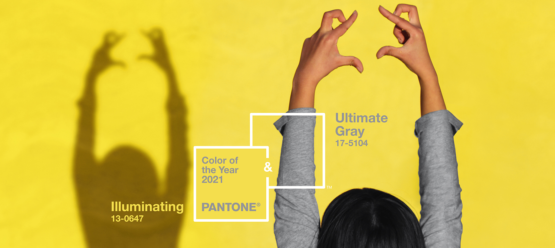
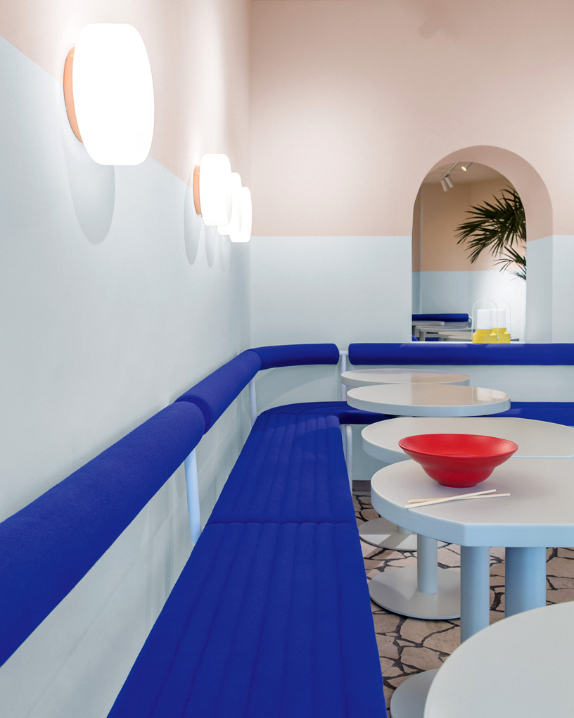
Although people may have different favourite colours, they experience the same effects. Whether you love or hate yellow, the same associations are associated with it. In fact, every colour may have several – often contradictory – effects. Designers who understand them can use a colour so that the viewer perceives it in the desired way. For instance, the yellow of the sun combined with green becomes the colour of poison and sourness. The lightness of yellow is enhanced by pink and becomes the colour of softness and warmth. The temperature of a room painted blue, for example, can seem up to 5 degrees colder than a room painted in warm shades. To give the relaxed feel of a Californian poolside, the team at Ester Bruzkus Architects skilfully adheres to the colour and style of a David Hockney painting in the interior design of the Berlin “LA Poke” restaurant. The soft, round shapes of the benches in bright blue are reminiscent of airbeds and are guaranteed to give a feel of summer. Such uninhibited combinations of rich colours from all parts of the colour spectrum attract a lot of attention, and when used in hotel and shop design, they create a breathtaking experience for visitors. Russian interior designer Daria Zinovatnaya is an expert in this field: at the launch of the “VVNK JANE PLUS” label at Shanghai Fashion Week, her Memphis-style shop installation demonstrated how to attract attention through strong contrasts without distracting from the fashion items themselves.
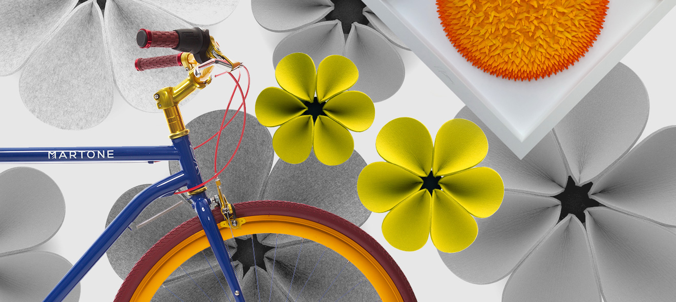
And that’s the best thing about colour: it can make everything a statement – not just accessories such as brightly coloured bags or jewellery, but also bicycles, table decorations or even a pouf on the living room floor.


2 Carafe and glasses by Vicara
3 Bag by Love Letter
4 Board game by Rex London
5 Bicycle by Martone Cycling


2 Earrings by Littlebit Design
3 Wall decor by Volker Kühn
4 Bag by Daff
5 Pouf by KARE Design
Sun in your heart
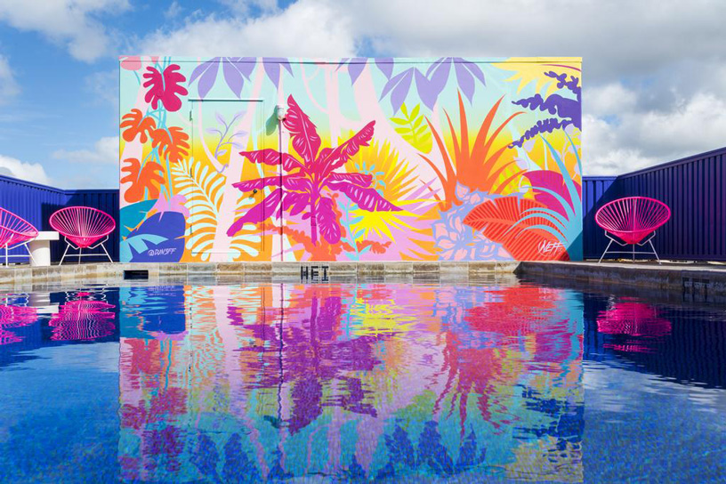
The colour combination of yellow, orange and red is regarded as the “colour scheme of pleasure”. People generally prefer strong colours to weak, and pure colours to mixed. The Pigalle basketball court is located between two grey facades in Paris – here is where “rebounds” and “slam dunks” meet artistic imagination. The French fashion brand Pigalle, creative agency Ill-Studio and Nike joined forces to jazz up the court with a fresh aesthetic that brings the colours of the setting sun onto the playing area. The choice of colours by the renowned design studio BHDM for the Shoreline Hotel Waikiki in Hawaii was similarly brash. It opted for strong colour tones that reflect the tropical flora and fauna of the island chain. On the rooftop pool deck, the mural by Californian artist DJ Neff uses a mix of the brightest colours to raise the chromatic temperature.